How design principles can complement medical communications writing
Wei Kwok
Medical writers have the enviable job, or not, of communicating the most relevant information about a healthcare product to a wider audience. Let’s face it – people don’t always get particularly excited when we make known that we’re “medical writers”. More often than not, the questions that follow are only asked out of courtesy to not end the conversation prematurely.
“You guys are a boring, dorky bunch!”
Harsh. But you can’t deny there is some truth in that – besides, how much fun could a 20-page document of medical jargons and statistics possibly be? Although we communicate with medical specialists most of the time, there are instances when we are required to communicate with a different audience.
It’s not always black and white
And by that, I really mean – words. When writing for purposes other than regulatory approval or publication, visual appeal and usability of deliverables need to be given more thought. Such materials may be:
- Patient information pamphlets
- Educational/training slides for Medical Science Liaisons and Healthcare Professionals
- Clinical summary for consumer health or marketing campaigns
- Web content
These materials usually incorporate the use of colours, lines, shapes, and graphics – all while keeping text to a minimum and ensuring the language is easily understood. White space and alignment are also key concepts to consider when developing less technical materials.
“Design is not a monologue; it’s a conversation.” —Whitney Hess, Empathy coach and UX design consultant1
The principles of design are widely applicable to various scenarios and professions. As medical writers, above and beyond technical jargons, our responsibility is to communicate information. Where materials can do away with a less structured format, design and user experience principles come in handy to complement the original content.
The parallels between design and medical communications
The parallels between design and medical communications
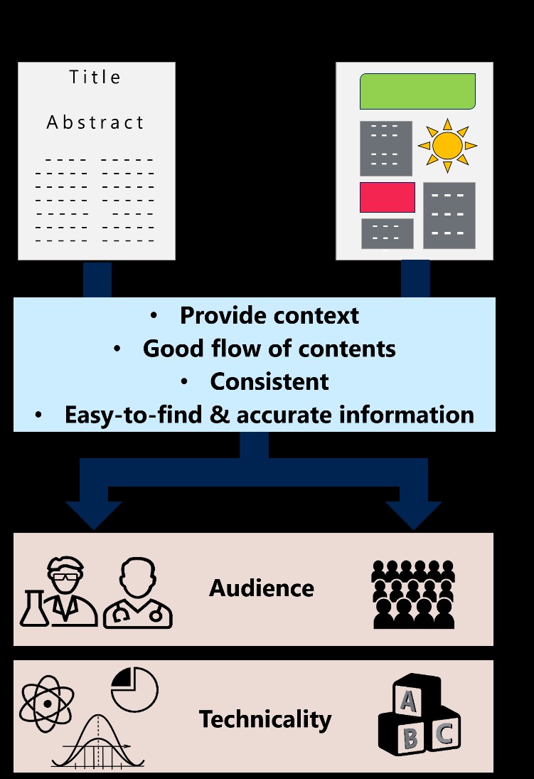
Take for example a manuscript and a patient information pamphlet, both of which have inherently distinct styles of presenting information. Nonetheless, both documents have to create a good initial impression, which is created with the manuscript title and abstract and the overall look of the pamphlet. A compelling manuscript title and abstract and layout and/or balanced use of text and graphics in the pamphlet then sustain interest of readers.
In terms of usability, both documents should provide context, have a good flow of content, be consistent, and have easy-to-find and accurate information (Figure 1). Distinctions between both documents may be such as having a “less is more” concept and eliminating jargons with pamphlets, whereas manuscripts may be expected to be more detailed and technical, with the use of jargons unsurprising.
Figure 1. Similarities and differences between a manuscript and pamphlet.
Think audience-specific content and delivery
Regardless the type of document, tailoring the relevance and comprehensiveness of the content is necessary for more effective communication of information to your desired audience. Design principles and elements are applicable to certain aspects of medical writing and may be helpful for elevating the visual appeal and usability of documents that do not have as many restrictions as a typical manuscript.
References:
1. Interaction Design Foundation. Design Principles. Available from: https://www.interaction-design.org/literature/topics/design-principles [Accessed 14 December 2019]